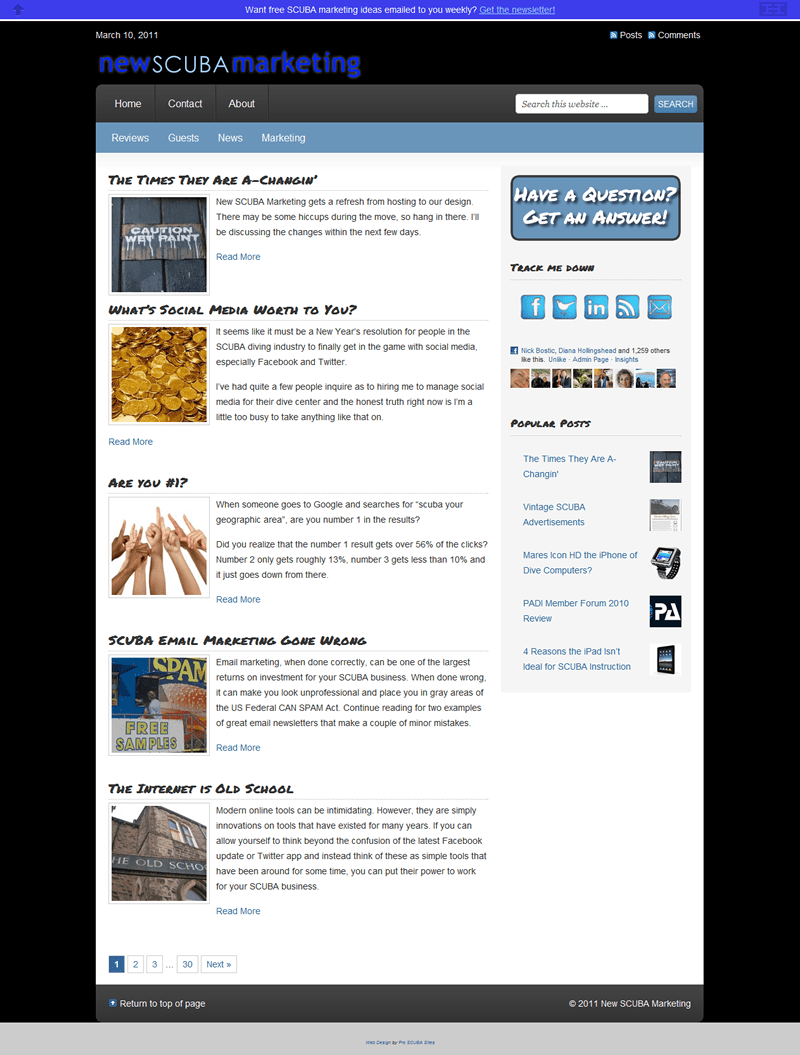
Anatomy of a Refresh
In my last post, I briefly mentioned a site refresh and some possible kinks that may be discovered. I think at this point everything is identified and either fixed or is acceptable in its current state.
A Brief Tour
In this post, I’m going to take you on a tour of some of the changes on the front end. In the near future, I’ll go over some of the changes on the back-end. For both, hopefully you’ll be able to take some ideas away for your own site.
To begin my refresh, I created a list of what I was hoping to do. For me, that list was:
- Simplify. I always felt like my old site was too busy. I tried a variety of widgets and plugins to achieve a variety of goals, but it ended up just feeling cluttered. The color scheme was designed to suggest the ocean, but it ended up creating a lot of eye strain for me as I stared at my site wondering what to do with it.
- Ease of Use. I wanted to get back to my roots as a neurotic web usability guy. Navigation across the top, search on the right, etc. Make it as simple as possible for people to find their way around. This includes cleaning up some header tags on old posts, which I’m still slowly but surely working through.
- Provide service. This site is here to help you, the SCUBA industry professional, to learn how to market online. As such, my goal is to make myself as accessible as possible.
Simplification
My old site always felt like there was too much stuff going on, at least to me. I wanted it more eye appealing which meant less clutter.
I’ve simplified the navigation. I’m consolidating categories to make that aspect even easier. Search is more prominent. I got rid of several of the sidebar widgets. The bottom bar is gone. The top bar is less obtrusive. The pop up for email subscribers is gone. The color scheme is more eye appealing.
Simple is good.
Ease of Use
As an internet marketer, of course I still want to build my email newsletter, generate traffic and get more Facebook Like’s and Twitter followers. But the goal is to make it easy while staying simple.
Want to Like my Page on Facebook? One click in the sidebar.
Want to share an article you’ve read via any imaginable method (while still not being cluttered)? There’s a share option with Facebook, Twitter and AddThis that follows along with each article, plus super-simple sharing at the end of each article.
Like what you’ve read and want to make sure you get new updates? At the end of each article, you can subscribe to the weekly digest.
Related posts are more engaging with thumbnails.
I’ve switched the comment system over to Disqus so it’s easier to leave a comment or subscribe to comments.
The top five most popular articles of all time are easy to find in the sidebar.
Easy to read, easy to share, easy to subscribe, easy to learn more. That’s the goal.
Provide Service
Again, the purpose of this site is to help SCUBA professionals to build their business using online marketing tools, so I needed to make it easy to be available.
In the top right is a button labeled “Have a Question? Get an Answer!” It’s the only pop-up on the site, but it takes you to a simple form where you can ask your question. It goes directly into my system as a draft post, so I can reply via an upcoming article.
All of the other aspects of simplification and ease of use help to offer a service as well. By making it easier to read each article, ask questions and find related content, I hope to help increase your knowledge about online marketing.